Contact
The Work

Explore the work.

Not a list of projects, a look at how we think, design, and solve. Every case below is a small interactive experience: touch it, don't just read it.

Curated showcase

Each project belongs to a different business, industry, and idea, so each one is shown a different way.

Storefronts, associations, internal tools, print systems, and booking builds. Open any case to try a piece of the solution, and watch for the studio notes between projects.

01 Our own product · Everyday budgeting

Owed

One budget app. A different shape for every person who opens it.

Two people at a desk looking over the Owed site together

Owed is a budget calculator built for daily use, not monthly guilt. It starts by asking who you are: a student flatting with mates, a family holding a mortgage, a freelancer smoothing a variable income. The interface reshapes around the answer. The categories change, the cadence changes, and the front screen carries one number that matters today. Same product for everyone. Same layout for no one.

2026 · Product design, brand & engineering · owed.co.nz

0sthe daily check-in, start to finish
0questions before the layout is yours
0spreadsheets anywhere in sight
1number up front: safe to spend today
Pick a life – the calculator reshapes itself
Safe to spend today $0

Three example lives, scripted, but the slider genuinely recomputes. The live product asks three questions and builds this screen around you.

The full story

A budget with your shape, not a template’s

“Most budgets fail because they were built for someone else’s life.”

Three questions

Budgeting tools ship one template: fifty categories, a monthly view, and an assumption that money lands on the first and behaves. Owed asks three questions instead, then derives everything from the answers. A freelancer gets a tax set aside and a quiet month buffer. A student paid weekly gets a weekly rhythm. Same app, same morning, two different front screens.

One number

The front screen carries a single figure: what is safe to spend today, once the essentials are covered and the savings have already left. Twenty seconds, once a day, and the decision is made.

Gentle by design

Nothing in the product turns red. An over committed week shows in gold and suggests the adjustment rather than announcing the failure. Bricolage Grotesque, Instrument Sans, IBM Plex Mono for the numbers, harbour blue and the Southern Cross, all carried from the first Owed.

The challenge

People abandon budgeting apps because one template has to fit every life. The tool had to fit the person before it counted a dollar.

What we built

A daily budget calculator that derives its categories, cadence and front screen from three onboarding questions, and carries one number each day.

The outcome

A twenty second daily habit replaced a monthly spreadsheet session, on the same brand and foundations as the first Owed.

What is next

Shared budgets for couples and flats, pay cycle intelligence for variable income, and imports so the numbers arrive on their own.

Owed, live
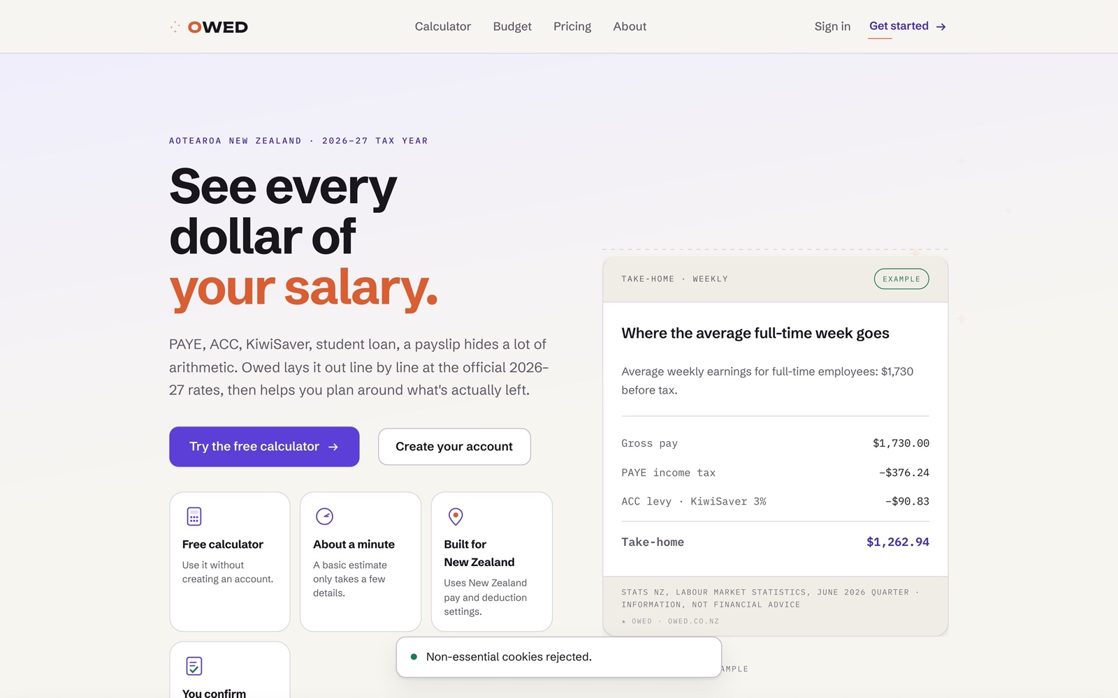
The Owed home page showing a weekly take-home breakdown
Every dollar of a payslip, line by line.
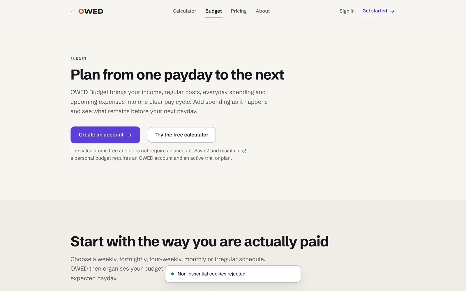
The Owed budget page, planning from one payday to the next
Planning from one payday to the next.
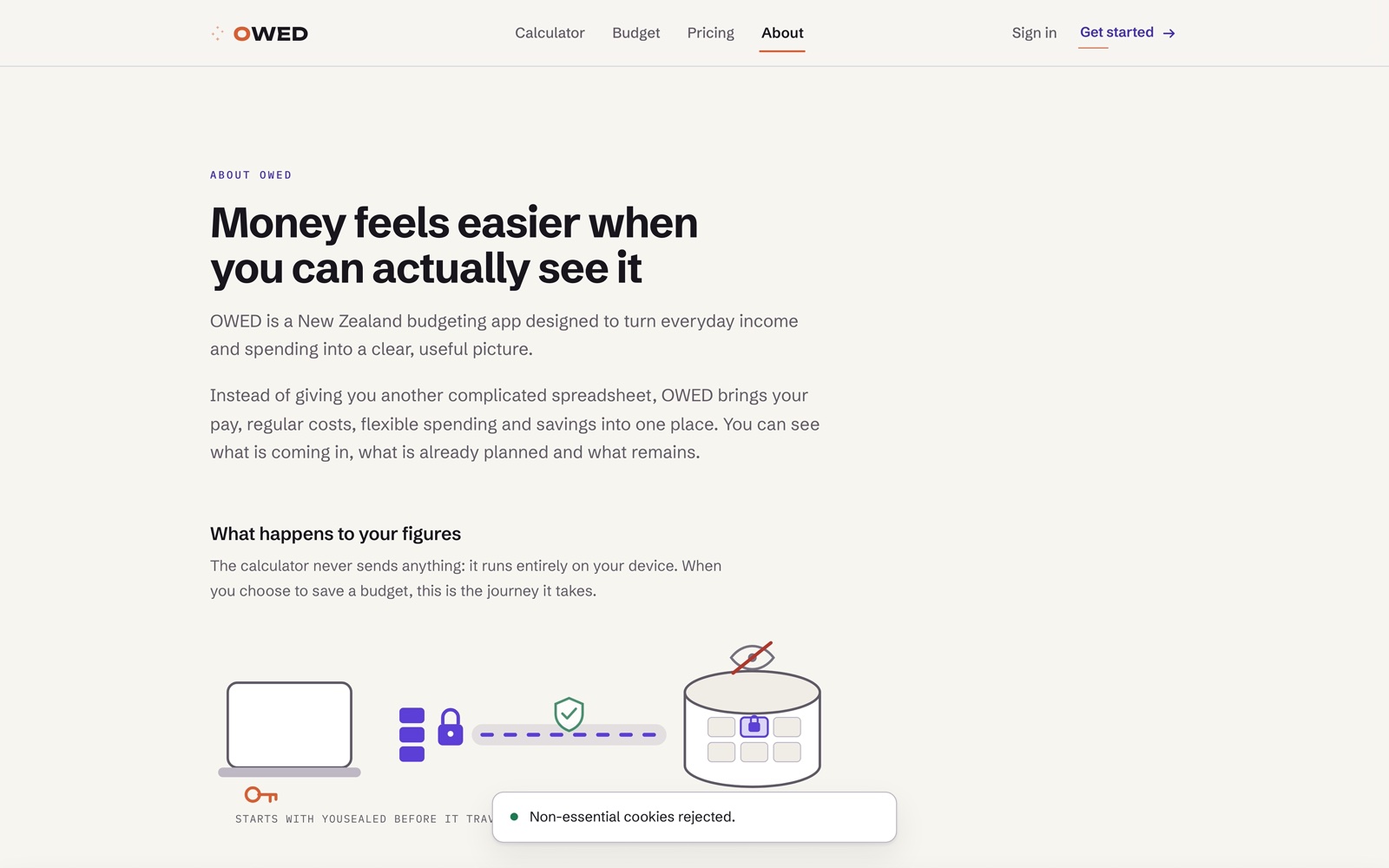
The Owed about page
Built for New Zealand pay and deduction rules.

Inside the account
Signed in
dashboard
Signed in
budget
Signed in
account
Built on what you already run

We work with the platforms businesses trust.

No lock-in to a stack you didn't choose. We meet your business on the tools it already uses, or recommend the simplest one that fits.

Websites

Custom buildsStatic & fastHeadless

Commerce

ShopifyWooCommerceCustom carts

Content

WordPressHeadless CMSStructured content
02 Association website · Live

FAANZ

The brief: make joining, staying informed, and finding support effortless for members right across the country. We rebuilt the structure around those three jobs and made every page quick on rural connections.

2025 · Association · Design, build, care plan

Up to 0× faster page loads versus the previous site, with membership enquiries handled in a single step.
The runway: the faster site is airborne first

Same content, a quarter of the wait. The rebuilt site is airborne in 1.9 seconds while the old one is still on its take-off roll past seven. On a rural connection, that is the difference between a member staying and leaving.

The full story

A whole digital experience, rebuilt

FAANZ represents flight attendants across New Zealand, and its members are almost never at a desk. They read between sectors, in crew rooms, in transit, often on a connection that barely holds. We rebuilt the whole experience around the three things a member actually comes to do: join, stay informed, and find support when something goes wrong.

What we rebuilt

Information architecture

We restructured around the three member jobs rather than the association’s committees, so the site answers the question the member arrived with.

Membership portal

Joining and managing membership collapsed into one step that works on a phone, in a crew room, with one hand.

Performance

We cut page weight hard and set a budget, because a site that fails on a weak connection fails the members who need it most. Pages load up to four times faster.

Accessibility

Real contrast, visible focus states, semantic structure, and text that survives being scaled up. A membership body should serve all of its members.

The measure of it is quiet: fewer calls asking where something is, and an enquiry that finishes in one step instead of three.

The association, live

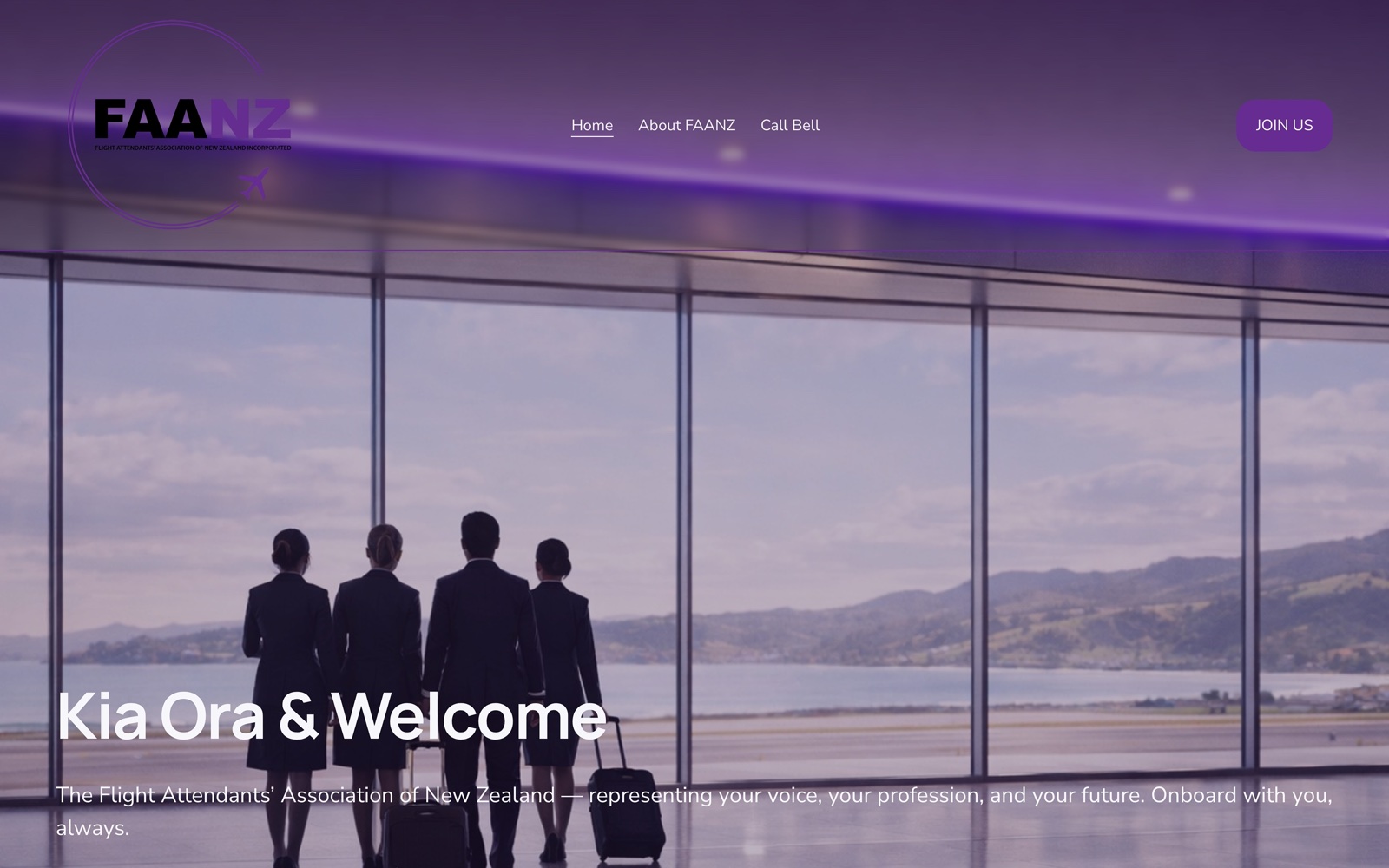
The FAANZ home page, cabin crew looking out over the runway
Crew, not stock photography of an office.
The FAANZ membership join page
Joining, collapsed into a single step.
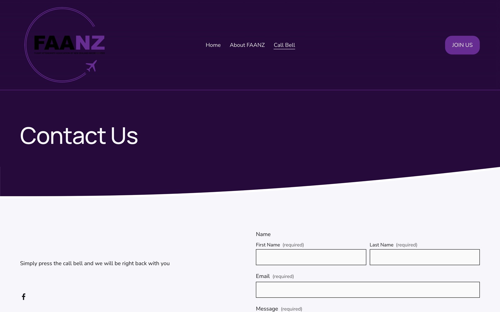
The FAANZ Call Bell member support page
Call Bell, where members go when something goes wrong.
Take payment the way people pay

Every gateway your customers already expect.

Local and global, card and buy-now-pay-later. We connect the checkout to the providers New Zealand shoppers reach for.

Cards & wallets

StripeWindcavePayPalApple PayGoogle Pay

Buy now, pay later

AfterpayZipLaybuy
03 Brand assets · Wine & hospitality Demo

Harbour & Vine

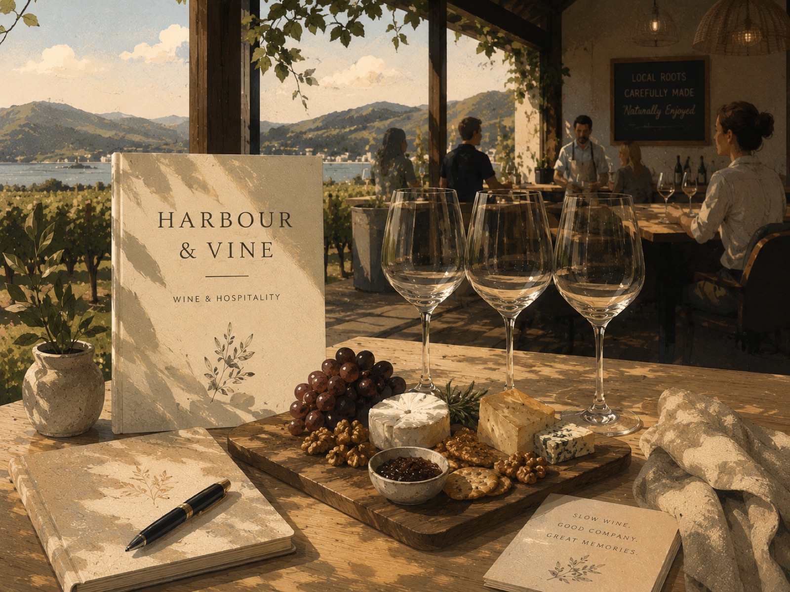
One kit that keeps every bottle, tasting card, and trade one-pager on-brand for a small Waiheke producer. Change one part of the system and it ripples, consistently, across everything.

2026 · Wine & hospitality · Print & brand

Harbour & Vine brand collateral at the vineyard
The tasting table
March

Sitting

Press Book a Tasting: the flight pours in order, the table draws together, and the reservation opens. Eight wines on the terrace, ninety unhurried minutes.

The full story

Harbour & Vine in depth

This is a demonstration project created to showcase brand and design capability. The winery itself is fictional. The identity, the tasting table and the booking experience below are fully designed and functional.

The challenge

A tiny producer needed every label, card, and trade sheet to look like one house, without a designer on call.

What we did

Built a compact design system of one palette, one type kit, and one mark, with rules simple enough to apply themselves, plus templates for the recurring pieces.

The outcome

Every bottle and one-pager now reads as the same brand, and new pieces take minutes rather than a design brief.

Next opportunities

A light e-commerce layer for cellar-door and trade orders.

Industries we enjoy

Different rooms, same care.

RetailHospitalityTourismProfessional servicesWine & foodTradesAssociationsOperations
Between the cases

Something similar in mind?

Start a Conversation
04 d3 · Two projects

d3

D3 Tape makes sports tape: strapping, kinesiology and cohesive bandage. Two separate pieces of work are shown here. The first is an internal financial reporting platform. The second is an audit and redesign of the United States storefront.

2025 and 2026 · Internal platform · Storefront redesign

<0min to produce a consolidated group report, in place of a manual process that took most of a day.
Open the platform
Entities reporting
6
Close time
2:41m
Group revenue · rolling
Group executiveAll entitiesShareExport
Entity financeOwn entityShareExport
MarketingCampaign dataShareExport
Six exports Manual spreadsheets One live report

Switch views. Every figure here is invented for this illustration. The platform itself is internal and not public, so this shows the structure only.

The full story

Two projects, in more detail

Two unrelated pieces of work: one internal and numerical, one public and commercial.

i  ·  Reporting platform

Month end across several entities relied on manual exports and spreadsheets. The work involved building an internal reporting platform that consolidates those figures into a single permissioned view, where each entity sees its own numbers and the group level sees all of them. Reporting time reduced from most of a day to under three minutes.

ii  ·  Storefront redesign

The United States storefront was organised by product, which assumed visitors already knew which tape they needed. The work involved auditing the site and rebuilding the front of it around a body zone finder, a shortened hero range and a pop-up covering the wider catalogue.

The d3tapeusa.com body-zone product finder with the knee selected
Point at what hurts, get the tape that suits it.
The four hero products on d3tapeusa.com
Four products at the top, not forty.
The range pop-up routing visitors to the global d3 site
A pop-up covering the wider catalogue.

Context

A month end assembled from spreadsheets, and separately a storefront organised by product rather than by what a visitor arrived looking for.

Scope

An internal reporting platform, and separately an audit and redesign of the storefront front end.

Result

Consolidated reporting in under three minutes, and a catalogue organised around the question a visitor arrives with.

Possible extension

Linking the finder to the tutorial library, so selecting a tape and learning to apply it sit on one path.

05 Website · Professional services Demo

Meridian Legal.

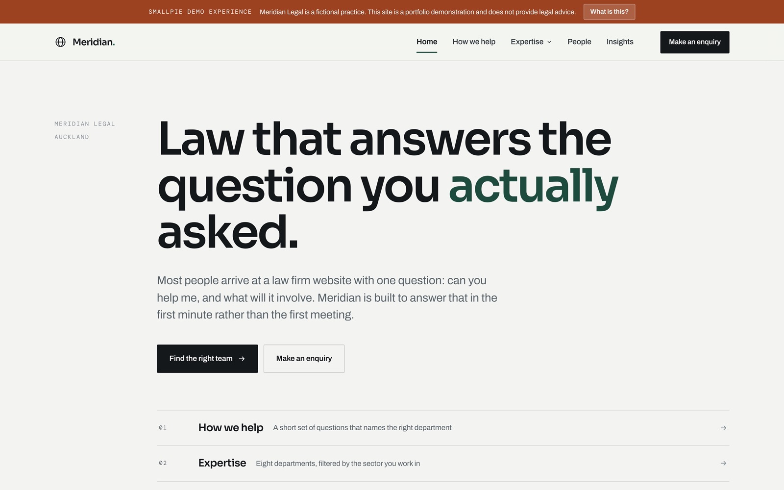
Stand apart from template law-firm sites without losing the gravity clients expect. We built the whole structure to answer one question fast: can you help me? Six pages, eight departments, and a help finder that routes a visitor to the right team without ever asking what happened to them.

2026 · Legal · Design & build · Live demonstration site

Meridian Legal brand collateral in the office
Concept study · a demonstration, not a live service

The live site routes with a short set of questions rather than a chat. This is the idea one step further: if Meridian answered the question before the phone call, it could work like this.

Ask me anything. I will point you to the right specialist and, if it helps, put a time in the diary.

A demonstration only, with a handful of scripted answers. It shows the shape of the idea: answer first, route to the right person second, book third.

The full story

Meridian Legal in depth

This is a demonstration project created to showcase design, development and user experience capabilities. The business itself is fictional, however the website and its functionality are fully operational.

Almost every legal practice reaches for the same navy, the same serif and the same photograph of a courthouse. We built this one as a document instead: numbered clauses, a margin column carrying the section label, hairline rules, near square corners. Authority comes from alignment rather than ornament.

Answering the question first

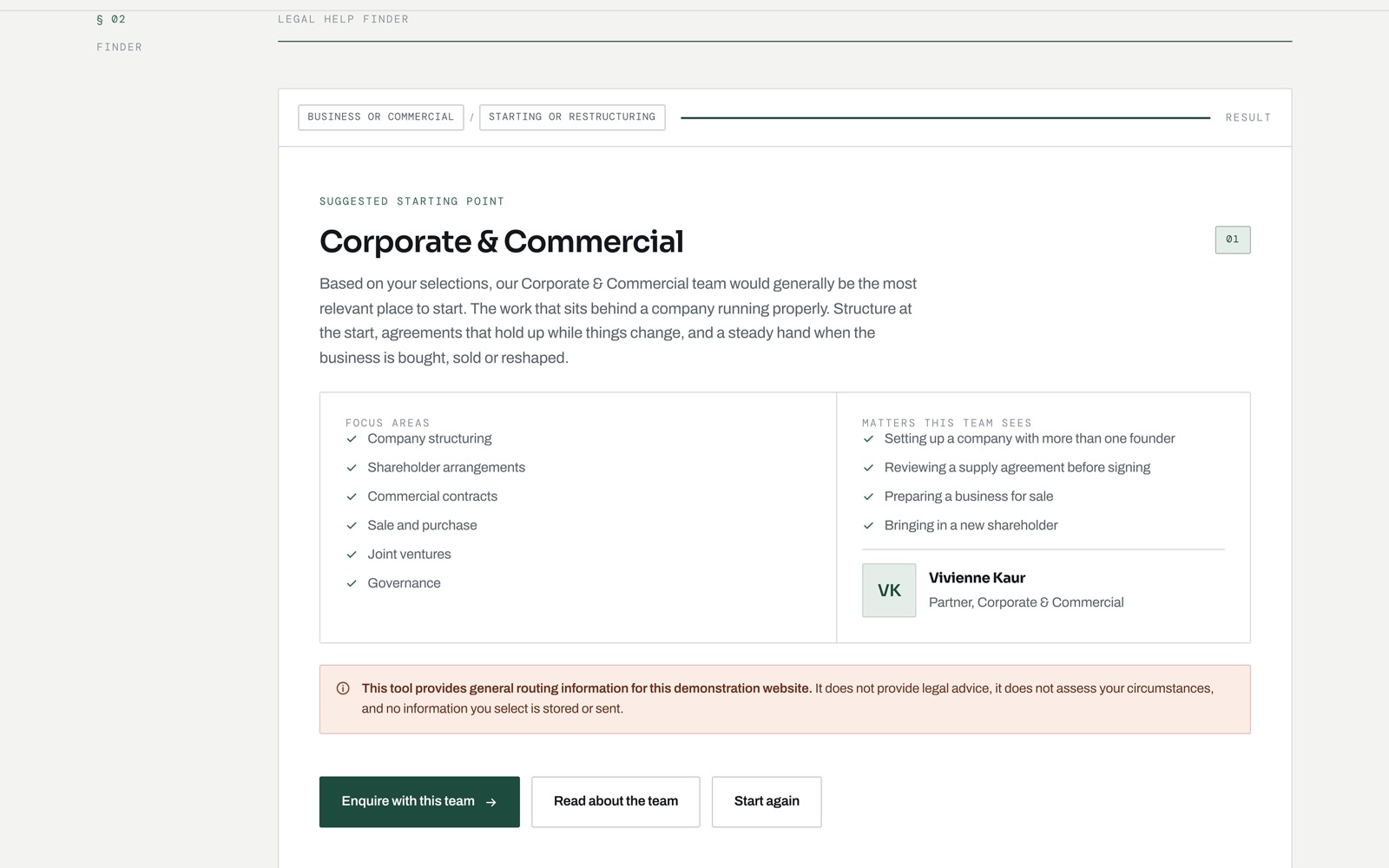
The Legal Help Finder carries it. Two or three plain questions map a visitor to one of eight departments, name the person who would pick it up, and hand off to a form that already knows where it is going. It routes rather than diagnoses, never asks for the facts of a situation, and says so on screen. The demo labelling uses a rust that sits outside the brand palette, so the warning can never read as part of Meridian.

The Meridian Legal home page, with the section index below the headline
A contents page, not a hero carousel.
The Legal Help Finder showing a routed result for Corporate and Commercial
The finder names a team, never a diagnosis.
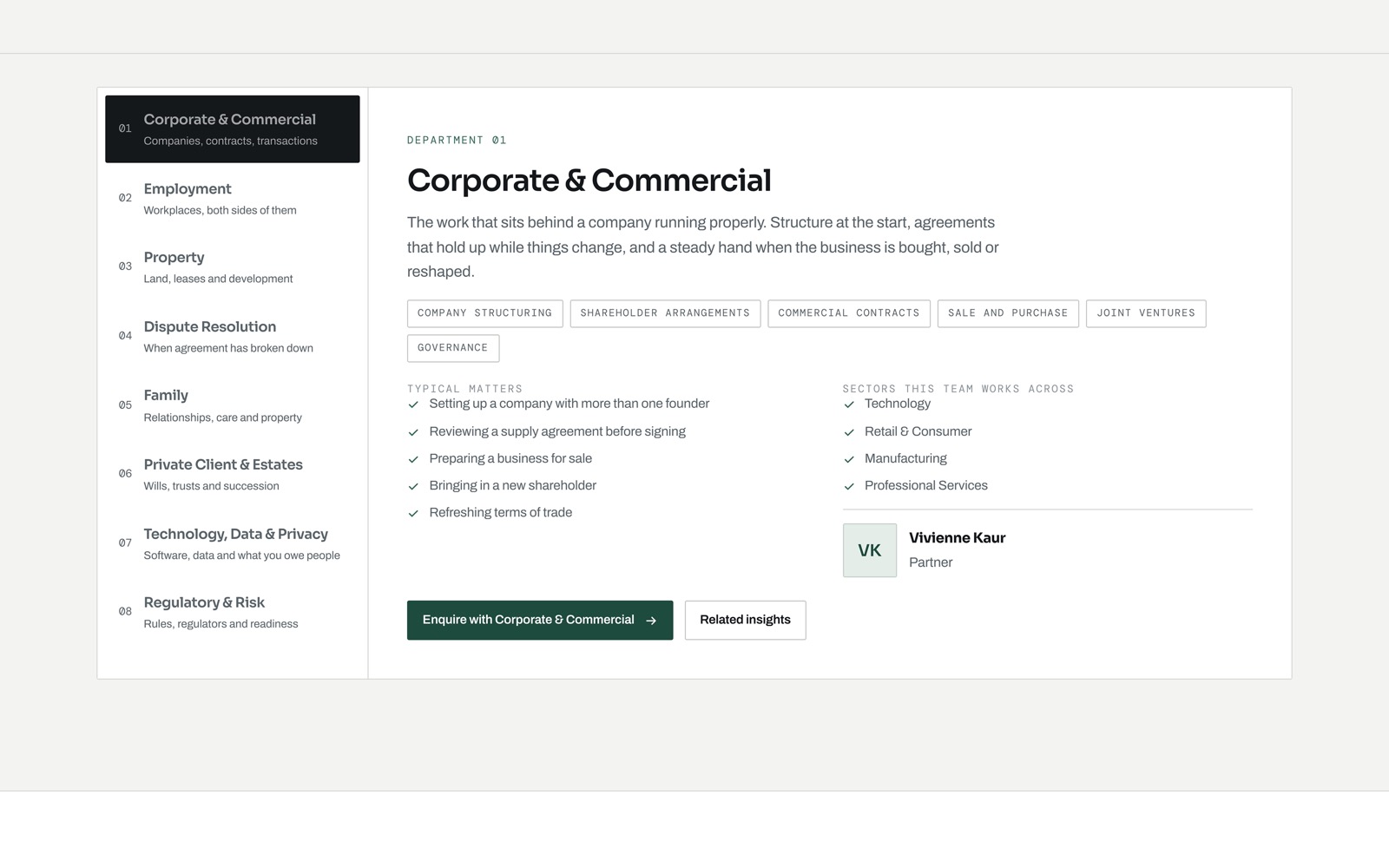
The expertise directory with eight departments and a detail pane
Eight departments, filtered by sector.

The challenge

Look as considered as the firm’s advice, and answer "can you help me?" without making a nervous client read legalese.

What we did

Six pages, a routing finder, a filterable directory, and an enquiry form that adapts to the team you pick.

The outcome

A site that reads with quiet authority and gets an enquiry to the right person before anyone picks up a phone.

Next opportunities

A secure client document portal, and the guided first answer shown above.

We design for the person on the other side of the screen.

01Speed is a featureEvery element a page carries is someone else's waiting time. We budget for it from day one.
02Clarity over clevernessIf a section needs a paragraph to explain itself, it becomes two sections.
03Accessible by defaultReal contrast, real focus states, semantic markup. The same choices help everyone.
04Built to hand overYou get a tidy CMS and a short playbook, so the site is yours to run, not ours to hold.
06 Booking website · Tourism Demo
A guide walking the group through the trail map above the lake

Southern Trails

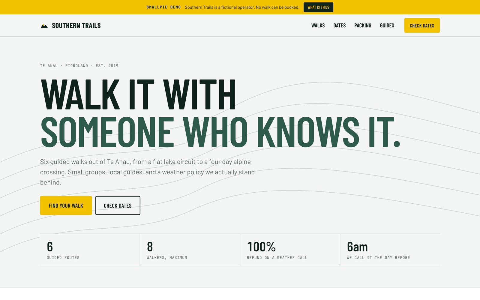
Guided-walk bookings for a Te Anau operator, under real-world constraints: seasonal availability, weather-day rebooking, and pages that stay quick on hut Wi-Fi.

2026 · Tourism · Design & booking build

Book a guided walk

1 · Choose a season

2 · Party size

3 · Conditions

Fine · long days

4 · Choose a departure

Pick a season, party size, and a departure, then confirm. Availability follows the weather; when a day washes out, the real site rebooks walkers automatically, before they lose signal.

0 states of weather on every date, so a walker reads the rebooking policy while they choose rather than after we call it off.
The full story

Southern Trails in depth

This is a demonstration project created to showcase design, development and user experience capabilities. The business itself is fictional, however the website and its functionality are fully operational.

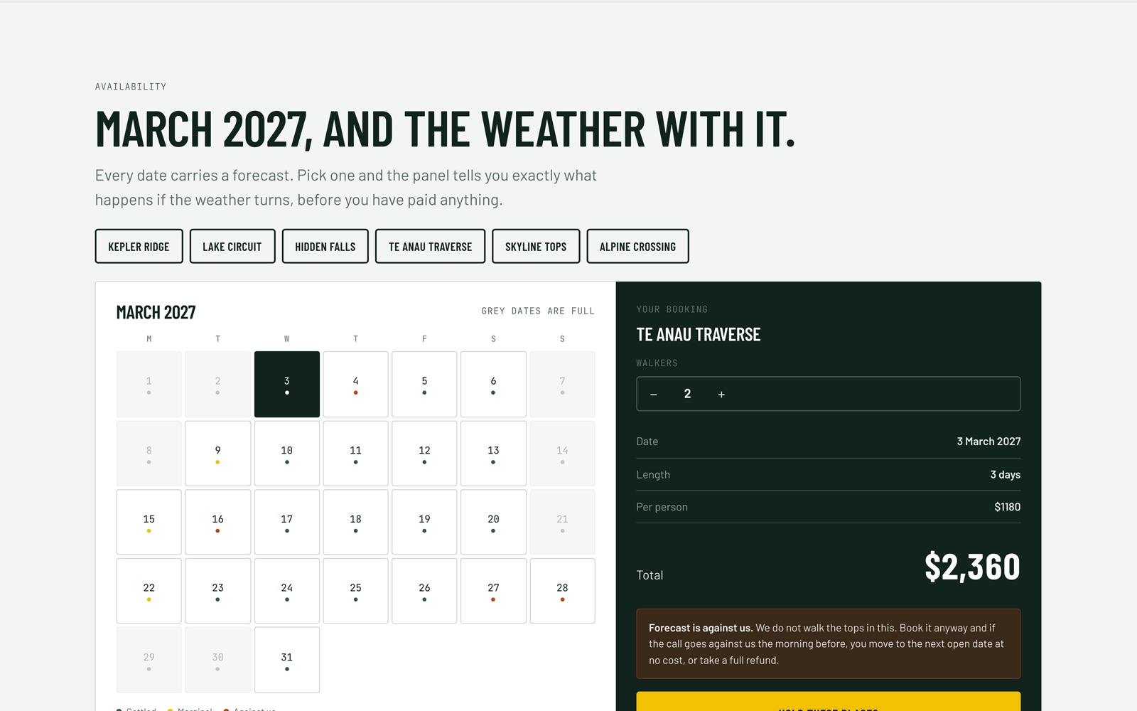
Most tourism booking flows assume the weather holds. In Fiordland it does not, and the operator carries that risk whether the website mentions it or not. So we put the forecast inside the calendar. Every date reads settled, marginal or against us, and choosing one tells you what happens if the call goes the wrong way, before you have paid anything.

Built like a field guide

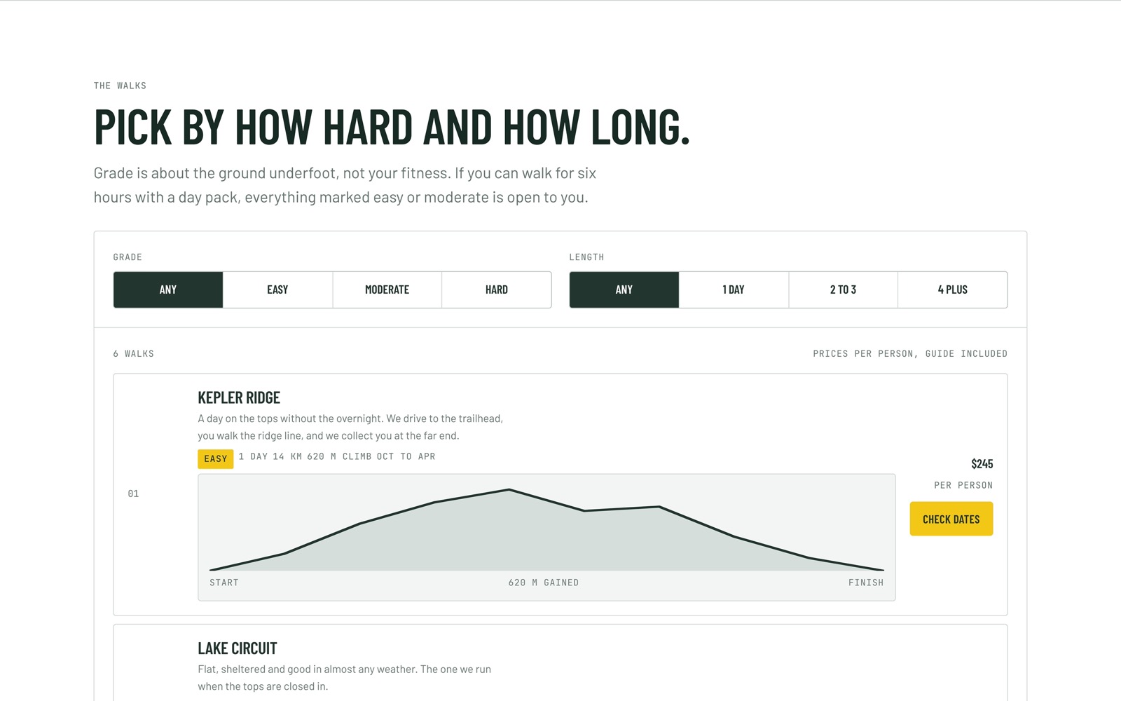
Condensed signage type, monospace for every number, contour lines behind the headline. We draw the elevation profiles from the climb figures rather than dropping in pictures, so each shape matches the data beside it.

The Southern Trails home page with contour lines behind the headline
A field guide, not a brochure.
The walk finder filtered by grade and length, with elevation profiles
Filter by how hard and how long.
The availability calendar showing a date the weather is against
The forecast sits inside the calendar.

The challenge

Guided-walk bookings under real constraints: seasons, weather days, and hut Wi-Fi that drops.

What we did

Built a booking flow that follows availability and weather, rebooks washed out days, and stays quick on a weak connection.

The outcome

A booking flow that states its weather policy at the point of choosing rather than burying it in terms. This is a concept build, so there are no live figures to report.

Next opportunities

Multi-day itineraries and gift vouchers.

07 Wellness studio · Yoga & meditation Demo
A morning class at the Moana Still studio

Moana Still

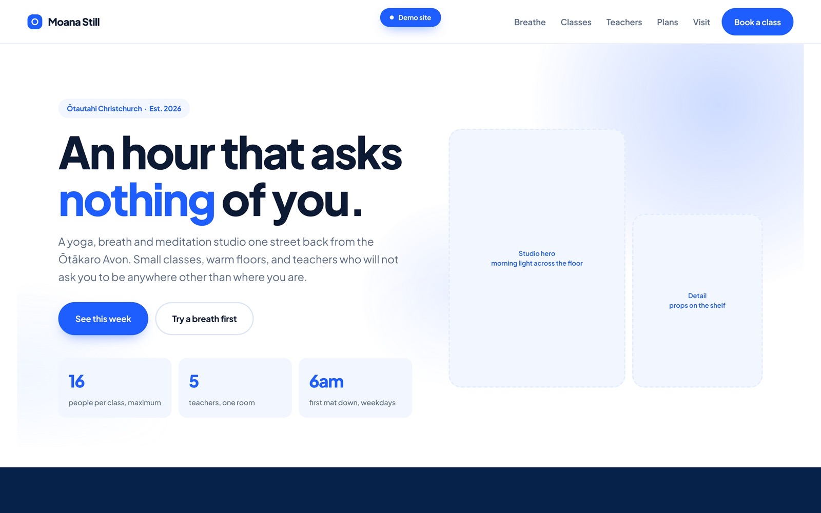
A yoga, breath and meditation studio one street back from the Ōtākaro Avon, in central Christchurch. Every other project in this archive is trying to move you along faster. This one had to do the opposite, and slow the visitor down before they had even booked.

2026 · Ōtautahi Christchurch · Wellness studio & class booking

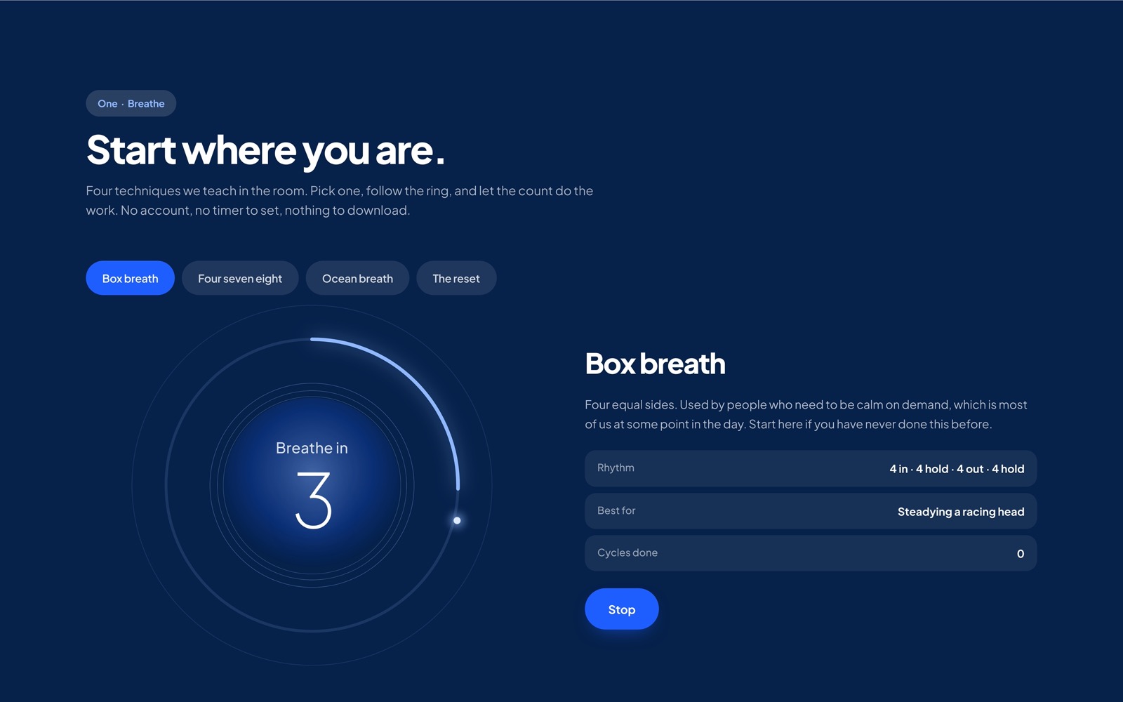
Today at the studio

Pick a session and breathe with the circle. The pace changes with the class, which is the whole point: the site should already feel like the room.

The full story

A website that had to slow you down

This is a demonstration project created to showcase design, development and user experience capabilities. The business itself is fictional, however the website and its functionality are fully operational.

Wellness sites tend to look like gyms: urgent, crowded, shouting about transformation in ninety days. That is exactly wrong for a studio selling stillness. We set ourselves a contrary brief: if someone lands here mid scroll, at speed, can the page lower their heart rate before they reach the timetable?

The directionThe site should feel like the room, not an advertisement for the room.

How the calm was built

Pace over density

Long lines, generous spacing, one idea per screen. Nothing competes for the eye.

A breath, not a form

The landing screen offers one interaction: a circle you breathe with, paced to the class you pick. It sells nothing and does more than any headline.

Coastal palette

Christchurch water and morning haze instead of the sage green every other studio uses.

Booking without friction

Timetable, teacher, one tap to hold a mat. The fastest part of the site gets you off it and into the room.

The studio, in use

The Moana Still home page, with the studio headline and class figures
An hour that asks nothing of you.
The breathing guide mid inhale, the ring part way through its sweep
The circle you can breathe with, mid inhale.
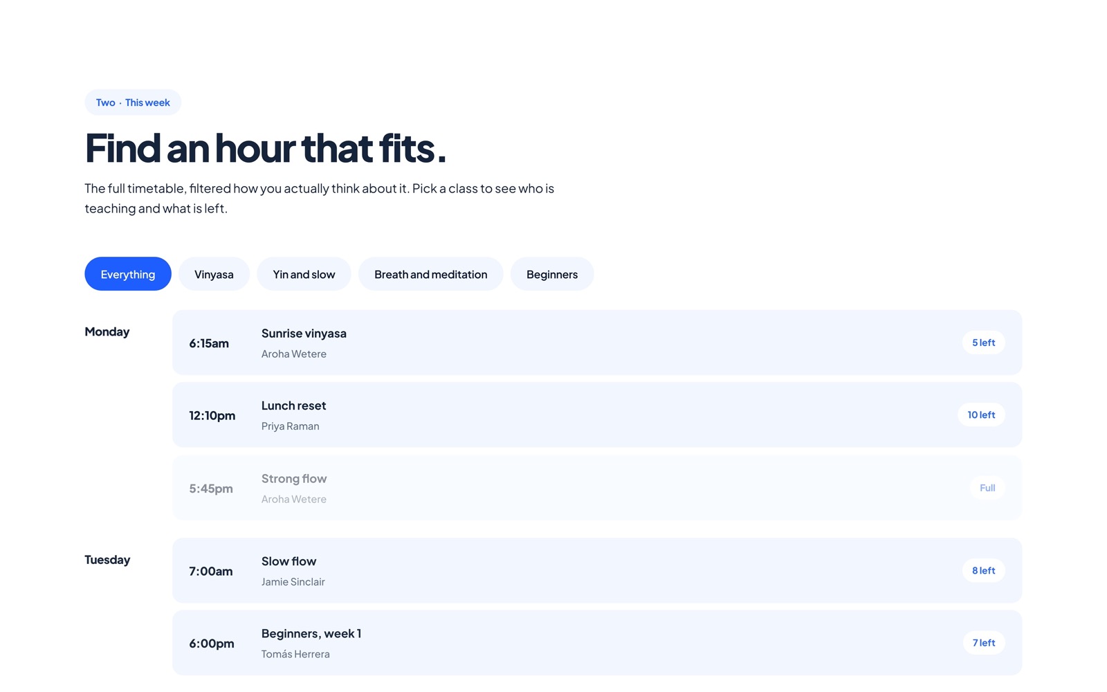
The Moana Still weekly timetable with class times and teachers
Timetable, teacher, one tap to hold a mat.
08 Subscription · E-commerce Demo

Cascade Coffee

A roaster moving from one-off bags to a subscription, without losing the feeling of a treat that lands on the doormat.

2026 · Food & beverage · Shopify subscriptions

Inside the Cascade Coffee cafe
The digital loyalty card
Cascade CoffeeApple & Google Wallet ready

No paper, no lost card, no ink stamp that never lines up. Six purchases and the last cup is free, ready to live in the wallet the customer already carries.

The full story

Cascade Coffee in depth

This is a demonstration project created to showcase design, development and user experience capabilities. The business itself is fictional, however the website and its functionality are fully operational.

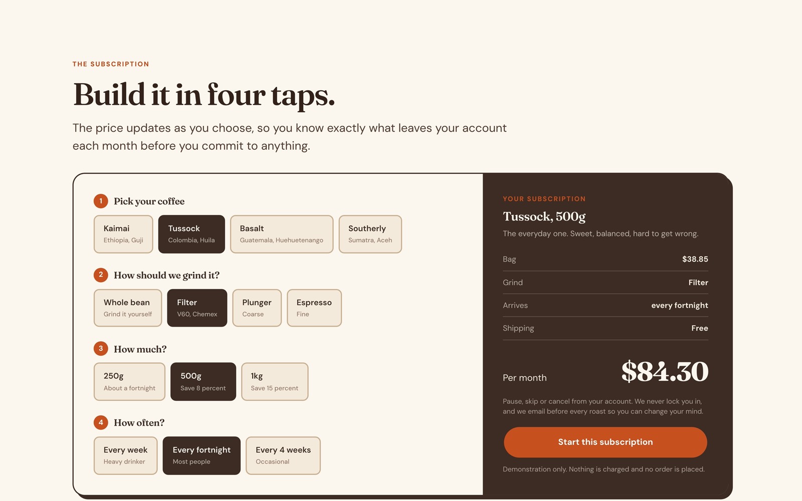
A roaster does not have a traffic problem, it has a commitment problem. People buy a bag happily, then think twice about a standing order, because a subscription reads as something you will later have to escape. So we removed that feeling: the price updates as you choose, skip and pause sit on the page rather than behind an account, and the copy says plainly that we charge on the morning we roast.

Warm, loud, and nothing like a web page

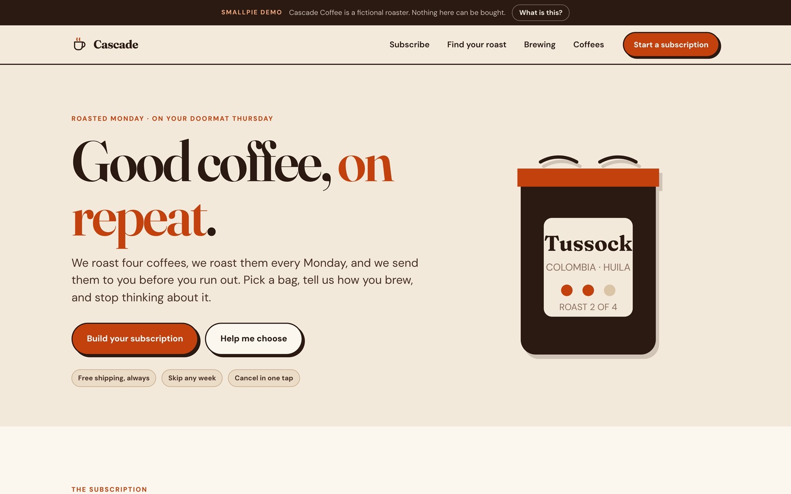
The design takes its cue from packaging rather than other coffee sites. Kraft paper, a soft high contrast serif, hard offset shadows, and a terracotta that does the shouting. Four coffees, each pinned to a roast scale, so choosing feels like reading a shelf.

The Cascade Coffee home page with the drawn coffee bag
Packaging first, web page second.
The subscription builder with the running monthly total
Four taps, and the price moves as you go.
The flavour matcher result showing a recommended roast
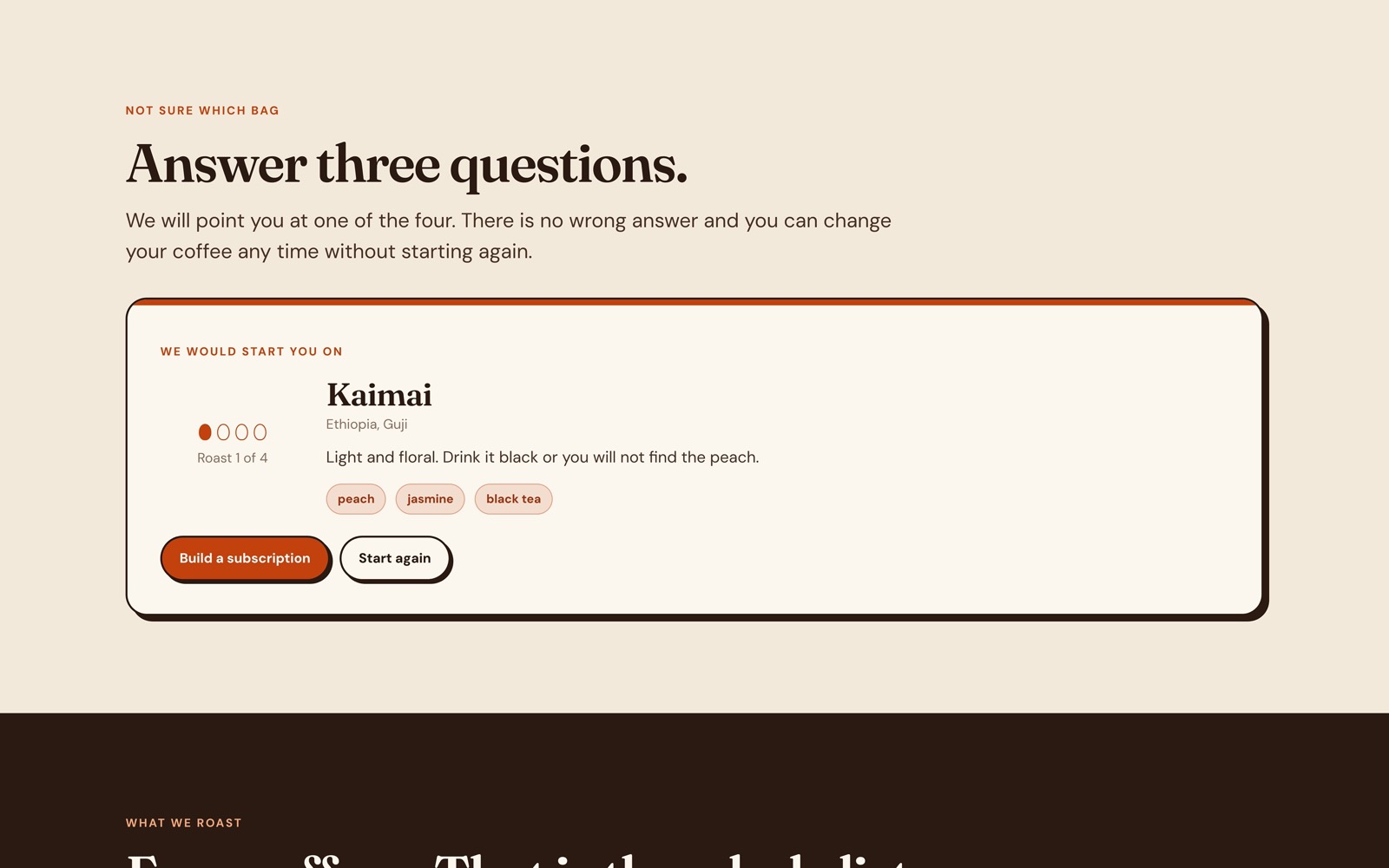
Three questions, one bag.

The challenge

Turn loyal one-off buyers into subscribers without the sign-up feeling like a commitment they would regret.

What we did

Built a subscription builder that prices itself as you choose, with pause and cancel one tap away.

The outcome

A treat that arrives on schedule, and a recurring revenue base the roaster can plan around.

Next opportunities

Gift subscriptions and a tasting-notes email with each delivery.

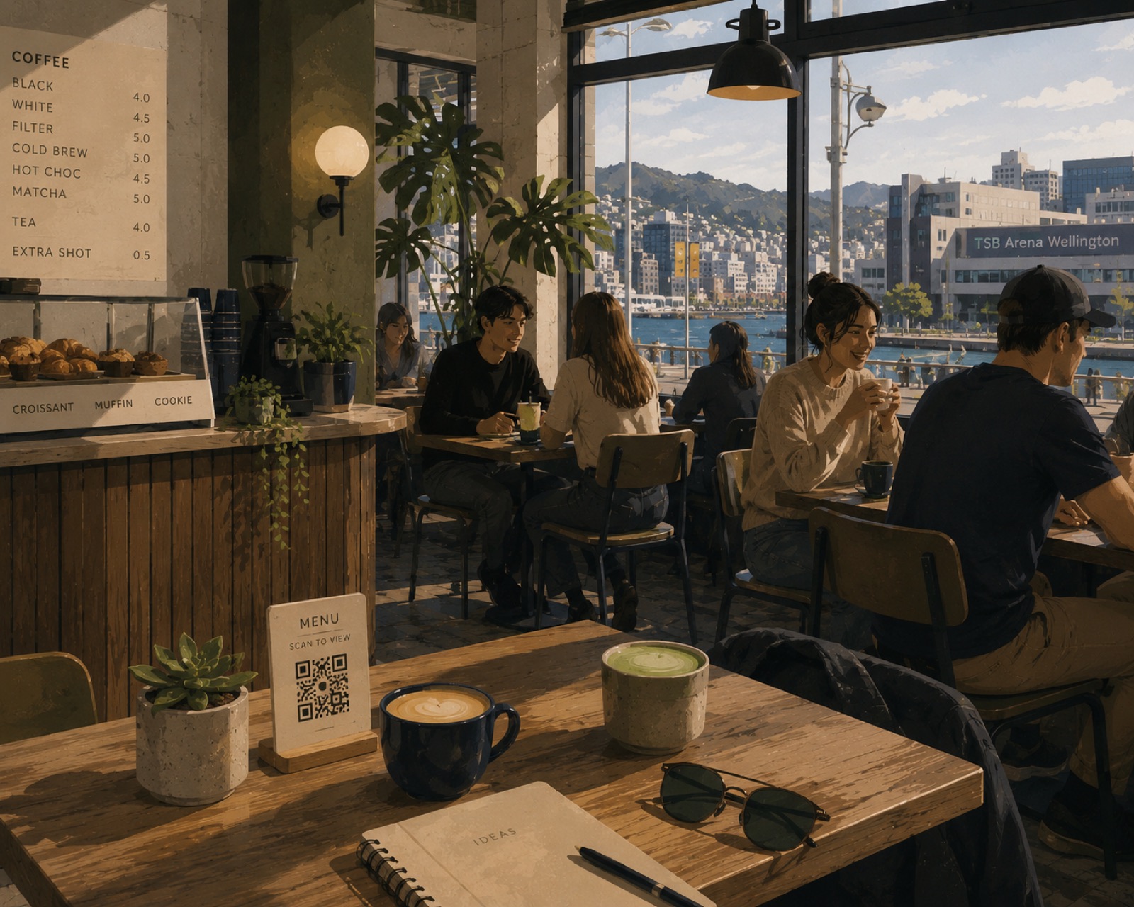
The Cascade Coffee counter, QR menu on the table
09 Commercial property · Listings Demo
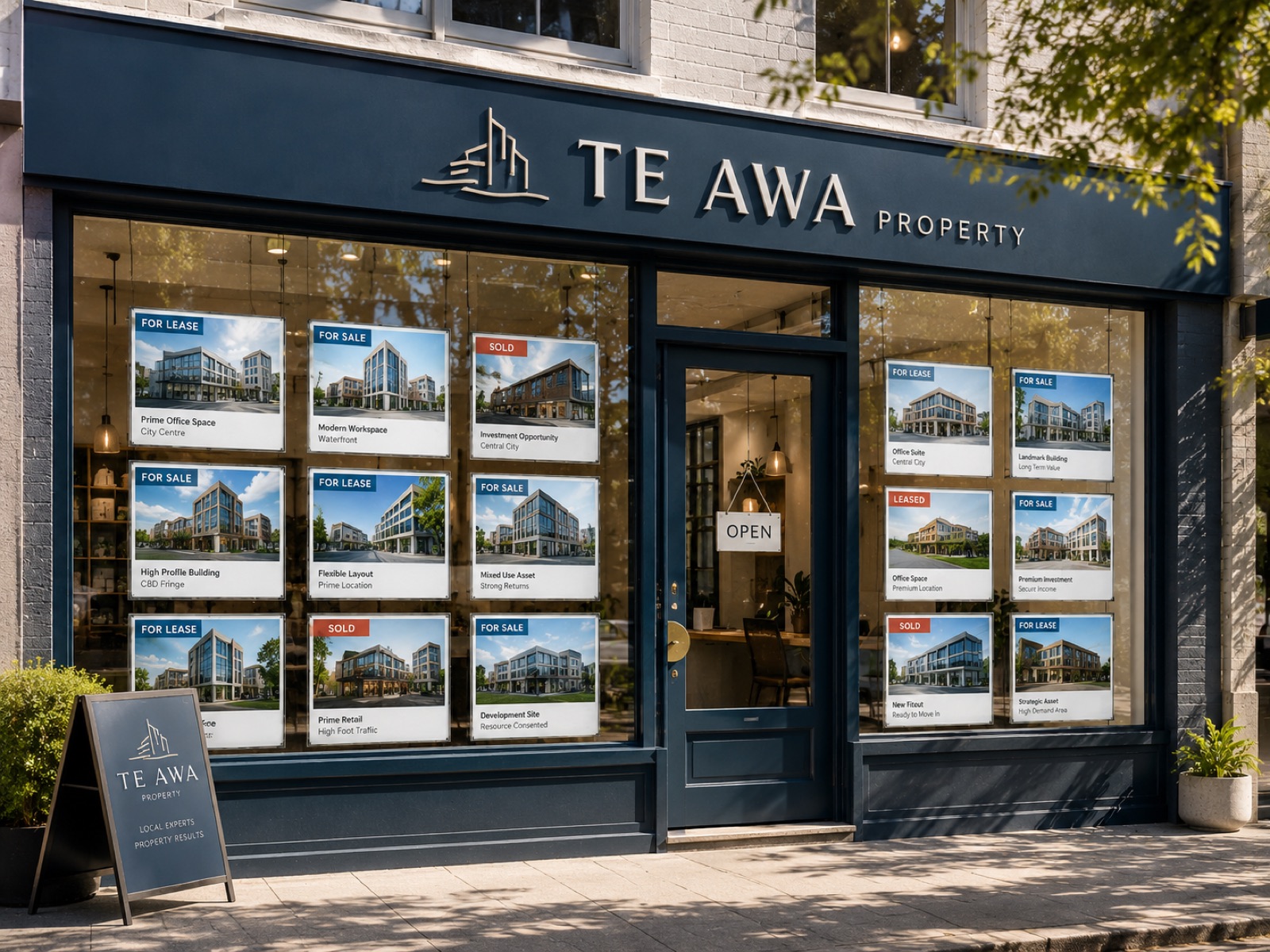
The Te Awa Commercial shopfront, window cards showing office and investment listings

Te Awa Commercial

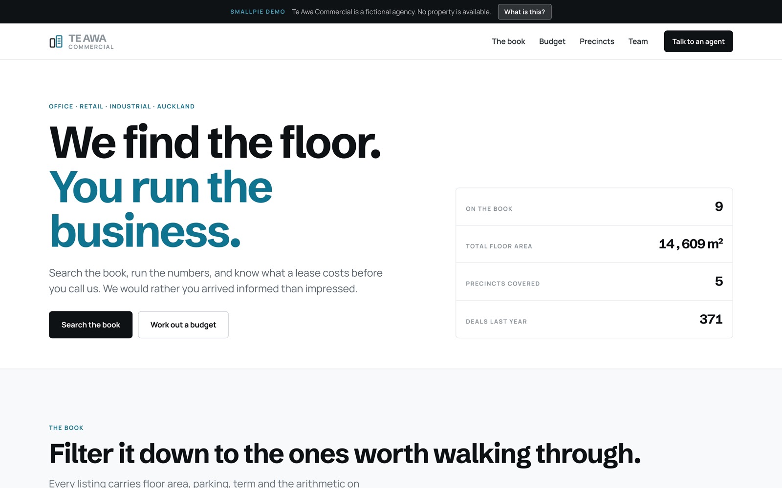
An Auckland agency letting office, retail and industrial space. Occupiers arrive asking how much room they need and what it really costs, so we answer both before anyone picks up a phone.

2026 · Commercial property · Website, listings & calculators

Featured listings
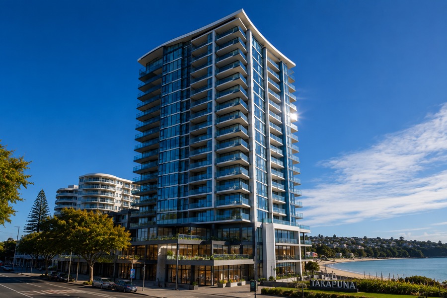
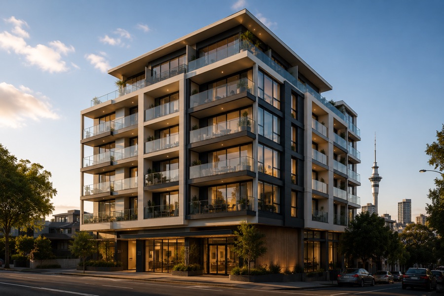
Glass office and retail tower on the Takapuna waterfrontFor lease
$530/m²Level 9, 12 Northcroft Street1,240 m² · office · harbour outlook
Modern mixed use building in Mount EdenInvestment
$8.90m118 Mount Eden Road2,050 m² · mixed use · 6.1% yield
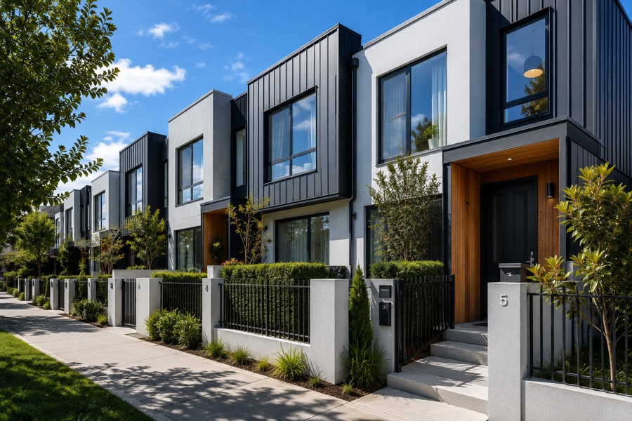
A row of six new townhouses in PonsonbyPortfolio
$11.4m42 to 52 Vermont Street6 units · residential investment · leased
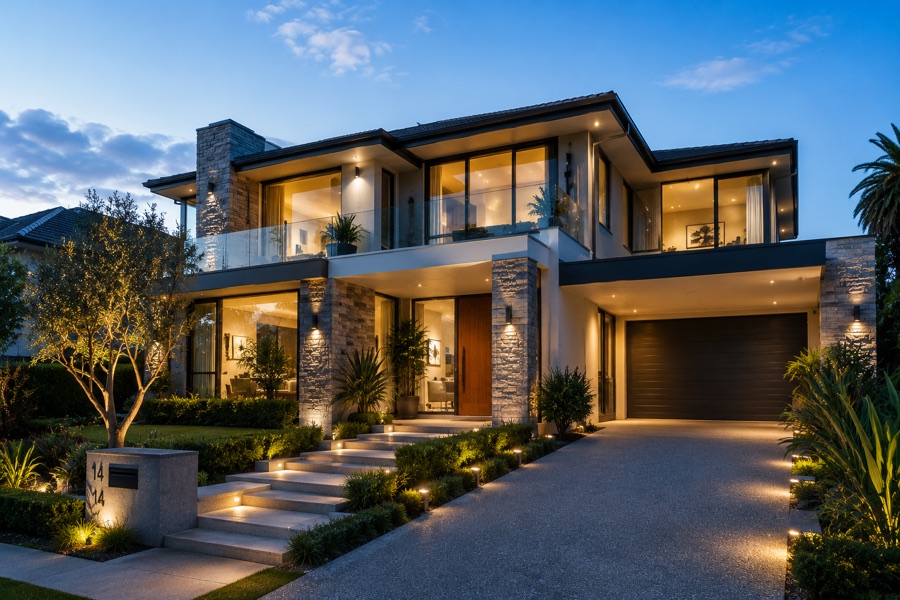
A single house on a large Devonport section, held as a development siteDevelopment
$3.15m9 Cheltenham Road1,240 m² land · consented for 4
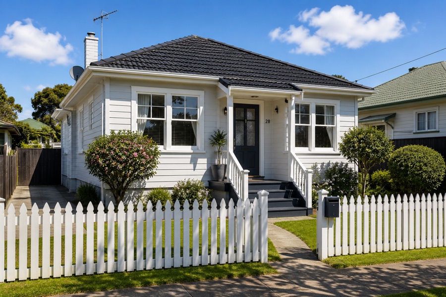
A villa on a full site in Grey Lynn, sold as landLand
$2.28m31 Surrey Crescent810 m² land · mixed use zone

Five featured listings, image-light so they load instantly. Browsing stays quick on mobile data instead of stalling on a heavy portal.

The full story

Te Awa Property in depth

This is a demonstration project created to showcase design, development and user experience capabilities. The business itself is fictional, however the website and its functionality are fully operational.

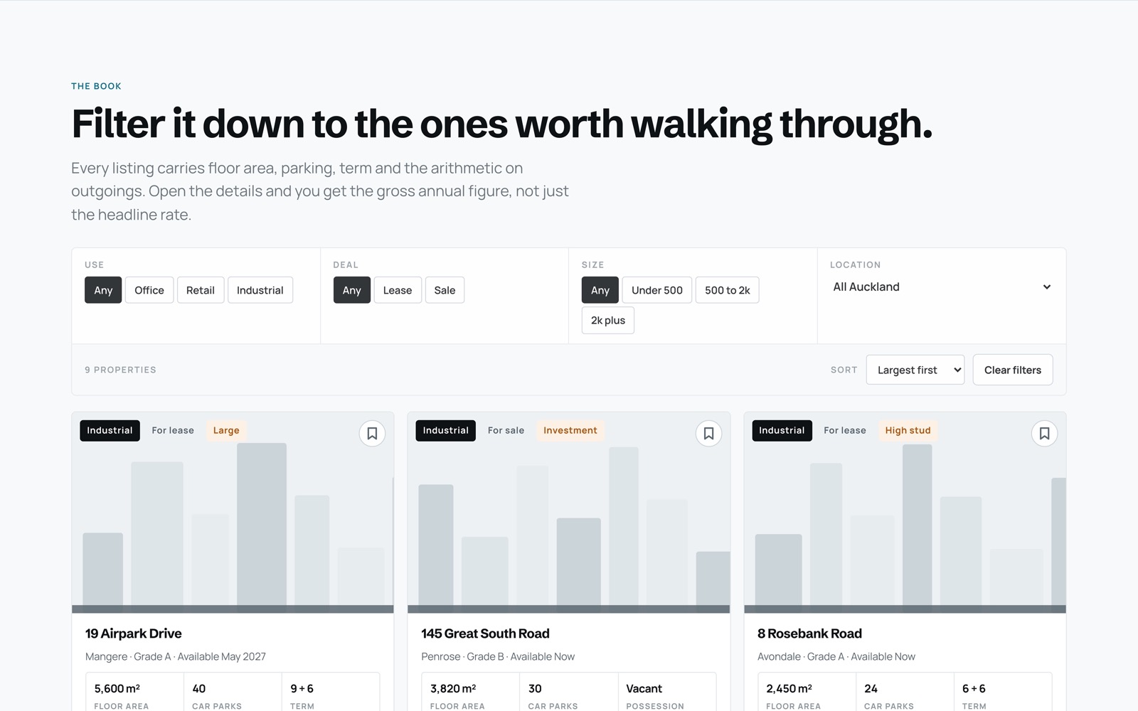
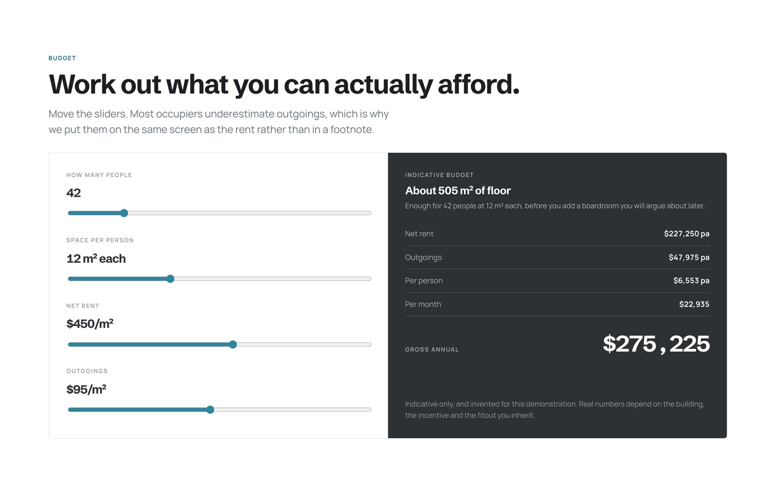
Commercial property runs on numbers, so we made the numbers the design. Occupiers arrive with two questions, how much space they need and what it actually costs, and most agency sites answer neither. Ours does both before anyone calls: the book filters by use, deal, size and precinct, and every listing opens to show outgoings and the gross annual figure rather than a headline rate.

Drawn, not photographed

Each building gets a silhouette generated from its own reference, because advertising fictional space with photographs of real premises would mislead. Tabular figures throughout, so columns of rents line up and compare at a glance.

The Te Awa Commercial home page with the live book summary
We find the floor, you run the business.
The listing book filtered by use, deal and floor area
Filtered to the ones worth walking through.
The occupancy budget calculator with live gross annual cost
Outgoings on the same screen as the rent.

The challenge

Occupiers cannot compare tenancies when every agency quotes a net rate and buries outgoings in a PDF.

What we did

We built a filterable book that does the arithmetic, a budget calculator that sizes the floor from headcount, and precinct data you can read in one screen.

The outcome

Enquiries now arrive with a floor area and a budget attached, so the first call starts halfway through.

Next opportunities

A live listing feed and saved searches that alert when matching space comes up.

10 Our own studio platform Always in progress

SmallPie

The one project with no brief, no handover, and no finish line. This site is where we try things before we recommend them, and it is the closest thing we have to a workshop with the door left open.

2024 → ongoing · Auckland · Design, build, and rebuild

Recently, on this site
NowCase studies became small interactive experiences rather than pages of screenshots.
BeforeThe estimate engine learned urgency pricing and de-duplication, so it stops charging twice for the same thing.
BeforeThe client portal grew a project journey instead of a status label.
BeforeThe loader became one continuous line, drawn rather than looped.

Everything on this list shipped here first. If it survives our own site, we are willing to put it on yours.

Behind the scenes

How we keep rebuilding our own front door

Most studios treat their own site as a brochure they update reluctantly. We treat ours as the first client, and a demanding one. Every pattern here earns its place before it reaches a paying project.

Brand philosophy

We chose old money restraint over novelty. Cream paper, royal navy, one gold, and a lot of considered air. Anything we add has to still look right in five years.

Motion system

One shared set of easings and durations, so nothing contradicts anything else. Motion explains something or it goes.

Interactive storytelling

We would rather you touched the work than read about it. Every case on this page is a small thing you can operate.

Inquiry engine

A guided brief that asks what a good first phone call would ask, in plain language, and produces something useful instead of dumping you into a contact box.

Performance

We sell speed, so we set a performance budget from the first line, size images to their slot, carry almost no third party weight, and test on a mid range phone.

Responsive design

Not one layout squeezed down, but different compositions per device. The Journal locks and scrolls sideways on a desktop and becomes a native swipe on a phone.

None of it is finished, and that is the point. If something here feels off, tell us. It is the fastest way to see how we respond to feedback.

Have a goal in mind?

Let's make it real together.

Tell us what you're building. We'll suggest the smallest slice that makes a real change.

Contact Us